WINK
THEORY
Brand Redesign · Content Production · Queens, NYC
A full creative rebrand for a lash lift and brow studio in East Flushing. We transformed the visual identity from a basic promotional aesthetic into a dreamy Korean ethereal world built around moody macro photography, bilingual content, and a new logo.
The Brand
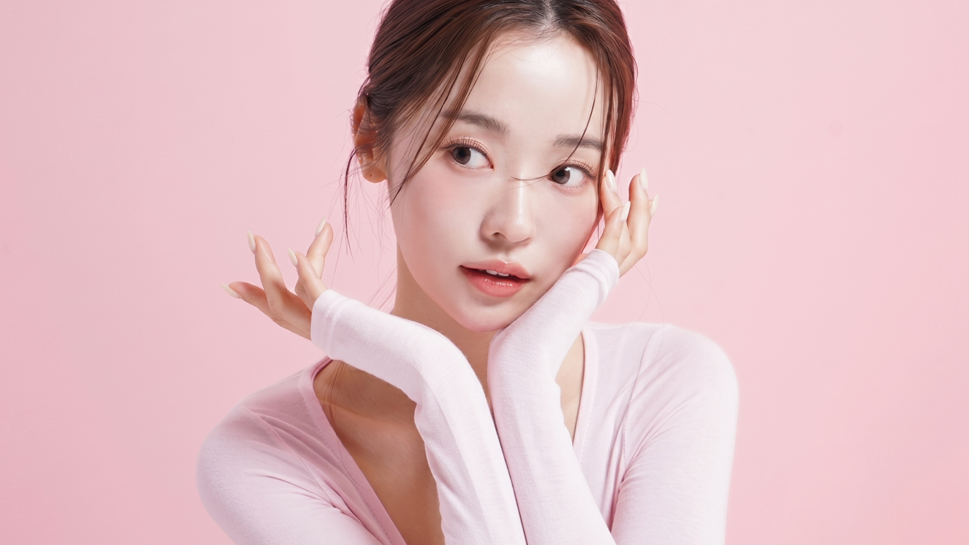
Where lash art meets Korean beauty.
Wink Theory is a licensed lash lift and brow studio based in East Flushing, Queens. Founded by Dani, a licensed cosmetologist specialising in Korean Keratin Lift, Brow Lamination, and natural enhancement techniques.
The studio had a growing local following but its Instagram presence did not reflect the quality of the work. The original aesthetic leaned on generic promotional graphics with a dark navy and gold palette — functional but forgettable.
The Brief
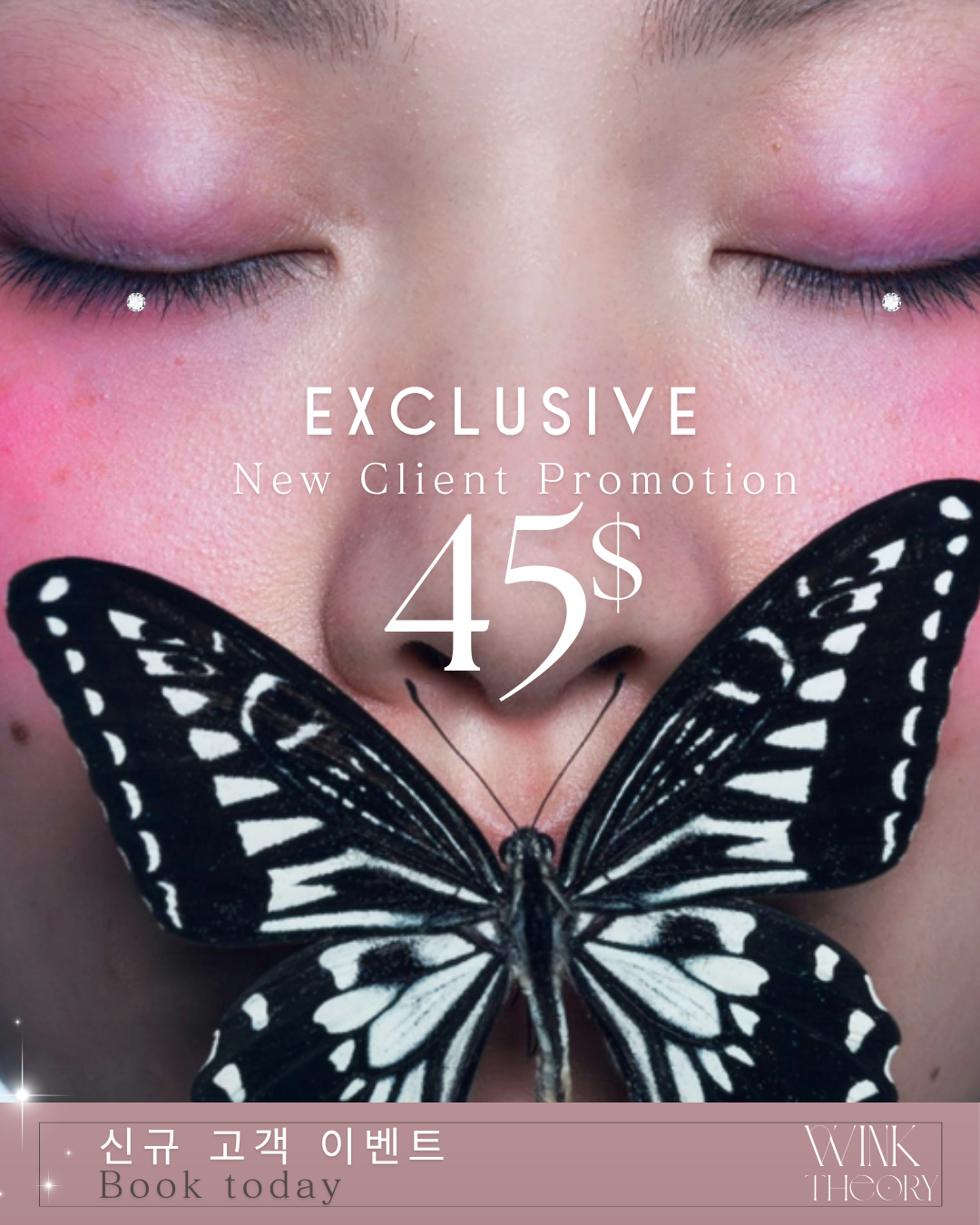
Rebuild the brand's visual identity from the ground up. A full creative rebrand including a new logo, a 9-square grid launch, and an ongoing content direction rooted in a dreamy Korean ethereal aesthetic.
The Transformation
Before.
After.
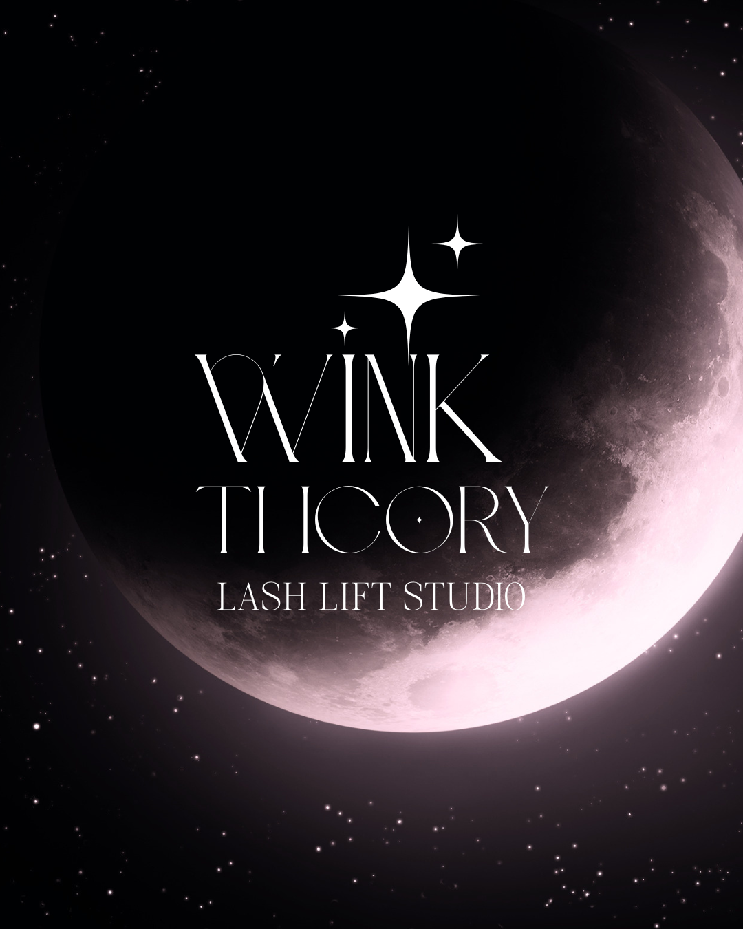
The original profile used a dark navy and gold promotional style with clip art hearts and standard text graphics. The rebrand introduced a charcoal and blush palette, macro editorial photography, a crescent moon logo, and bilingual Korean content to speak directly to the Flushing community.
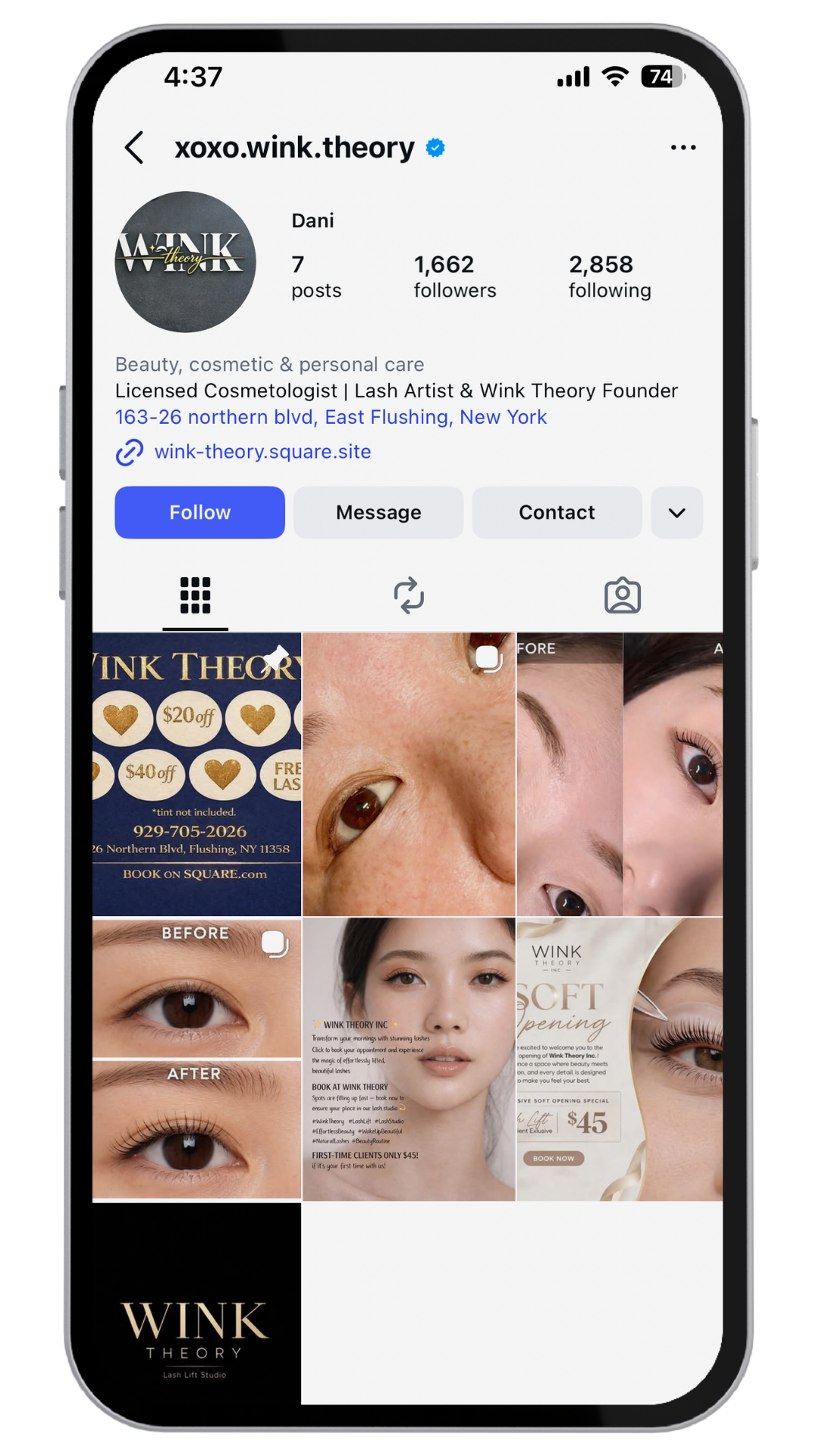
Dark navy and gold palette with clip art hearts and generic promotional graphics. The content was functional but lacked personality and did not reflect the quality of the work inside the studio. Nothing to differentiate it in a crowded beauty market.
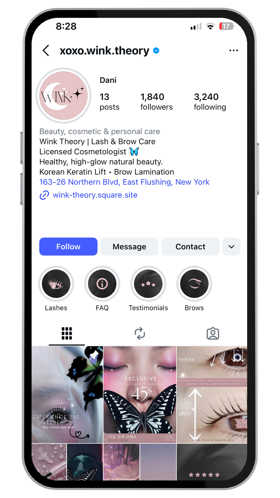
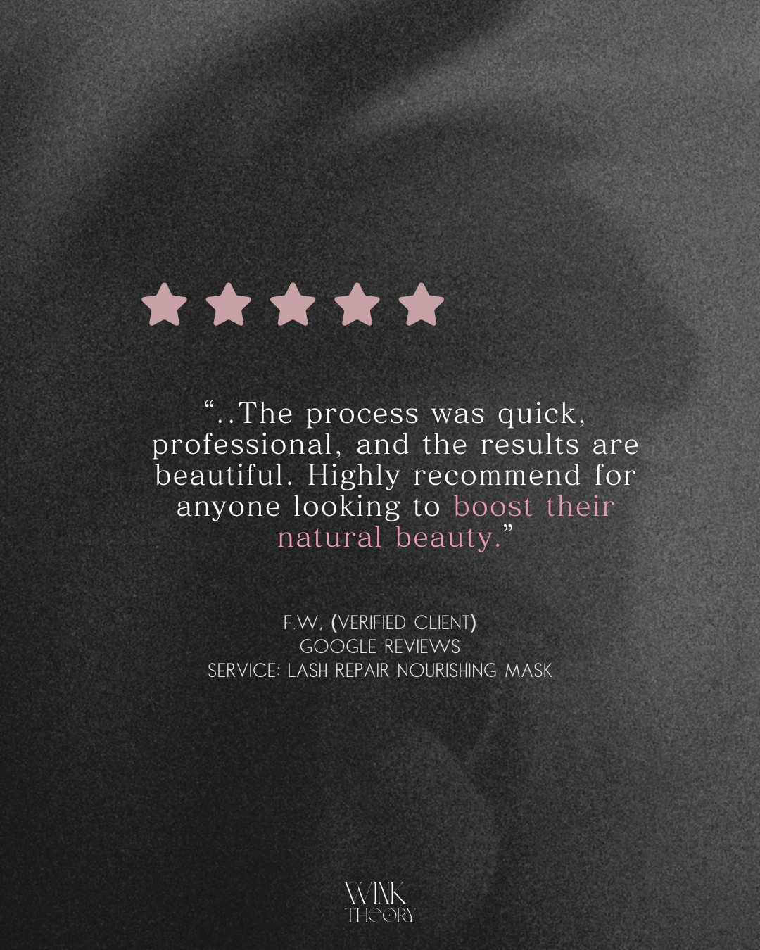
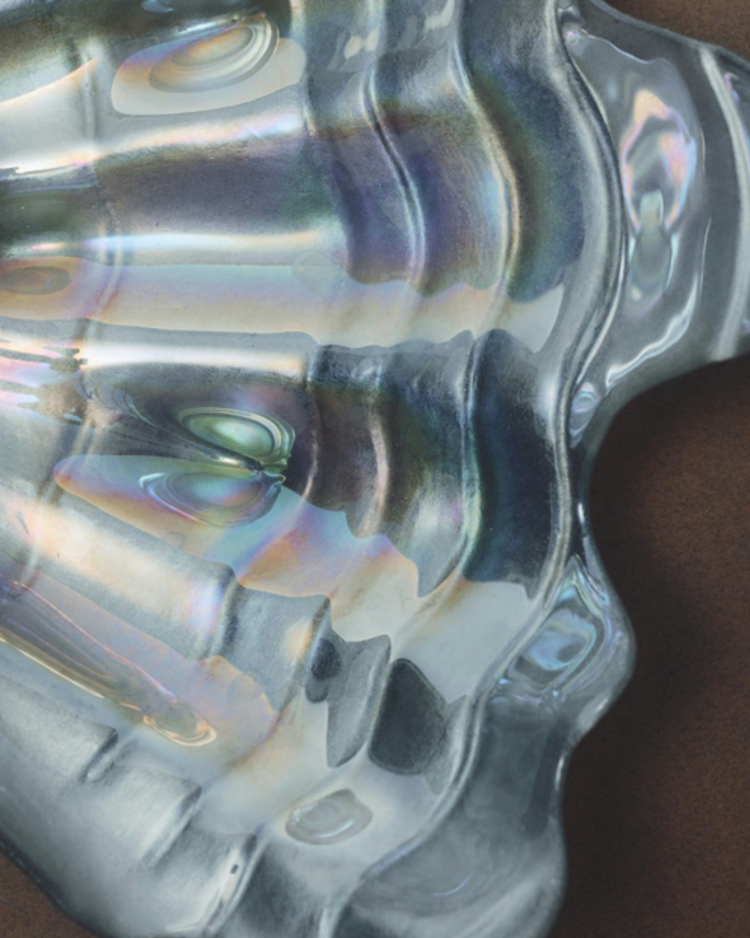
Soft charcoal and blush palette with a new crescent moon logo, moody macro photography, and bilingual Korean content. A dreamy, editorial aesthetic that speaks directly to the Korean-American community in Flushing and positions Wink Theory as a premium destination.
The Deliverable
9 squares.
One world.
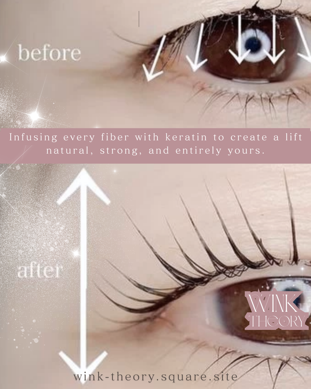
The 9-square grid launch was designed as a single cohesive visual statement. Every tile was planned to work both individually as a standalone post and as part of the wider grid composition — a technique common in Korean beauty accounts that creates an immersive first impression when a new follower lands on the profile.
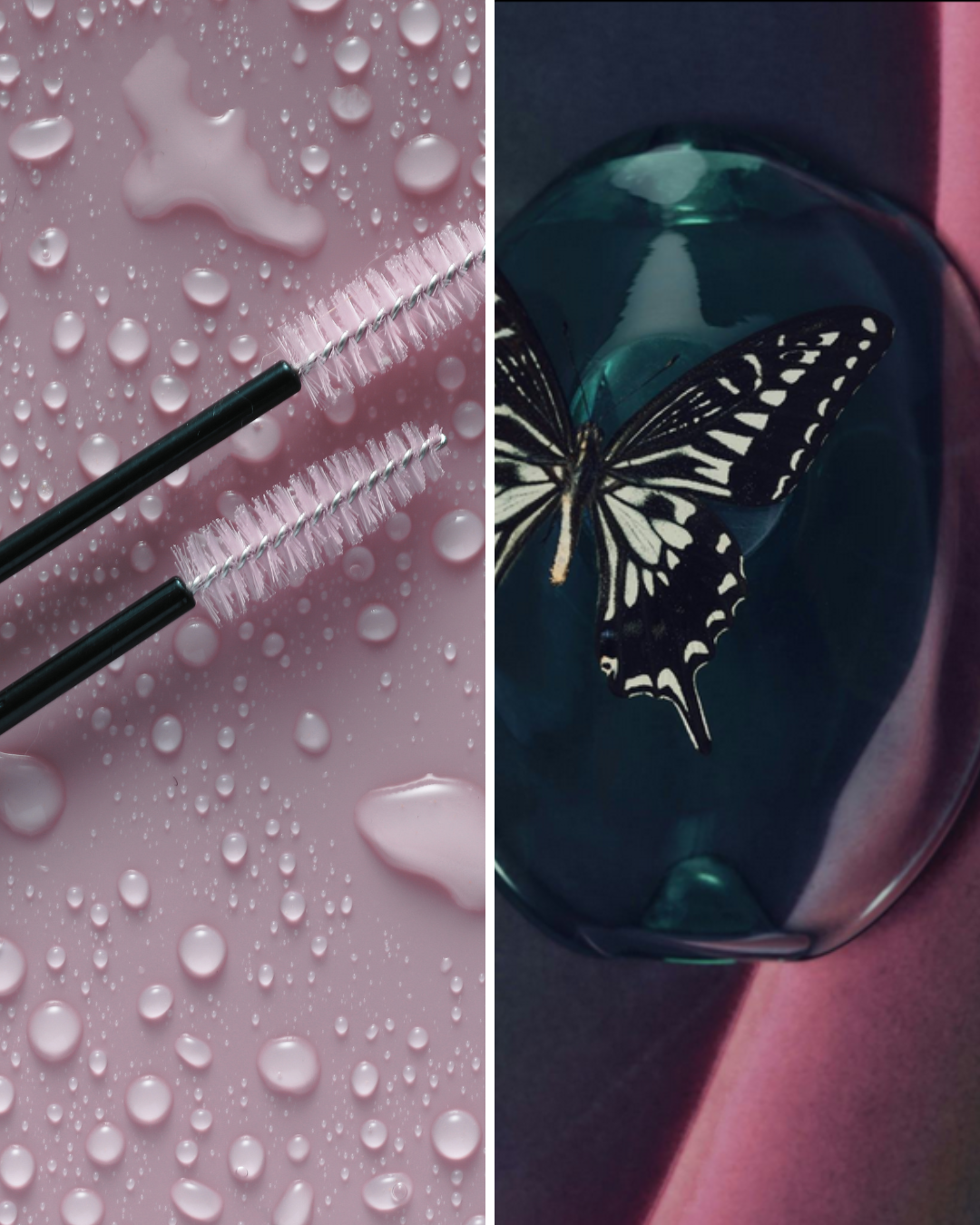
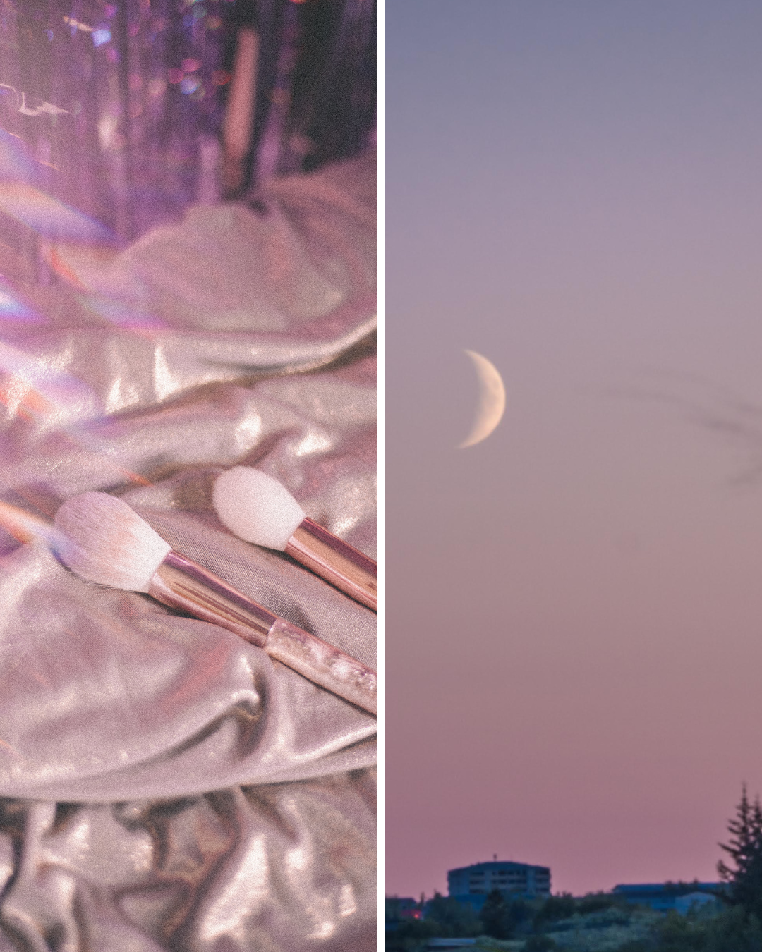
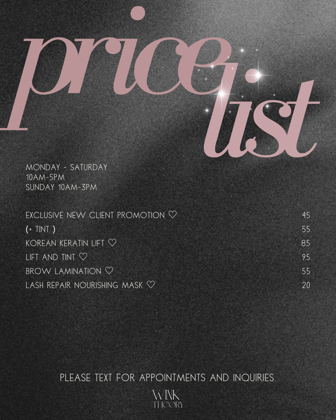
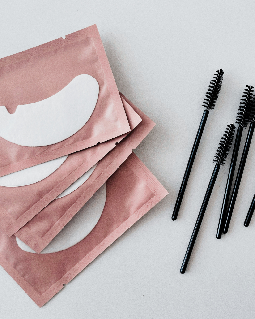
Moody macro close-ups of lashes, butterflies, and beauty textures. Soft charcoal backgrounds. Bilingual captions in Korean and English. Price list posts with editorial typography. Each post designed to stop the scroll and signal premium quality.
The Results
Numbers that moved.
The rebrand delivered immediate and measurable impact. A new cohesive visual identity, a stronger connection with the local Korean-American community, and a profile that now reflects the calibre of the work inside the studio.
From 1,662 to 1,840 followers following the rebrand and 9-square grid launch.
Significant increase in content reach driven by the new editorial aesthetic and bilingual strategy.
Full 9-square grid designed and produced as a single cohesive visual launch.
Premium French CBD brand. SEO revamp, multiple page one Google rankings, and 427% organic reach growth without a single paid ad.
READY TO
REBRAND
YOUR WORLD?
Free 15-minute consultation. No commitment.